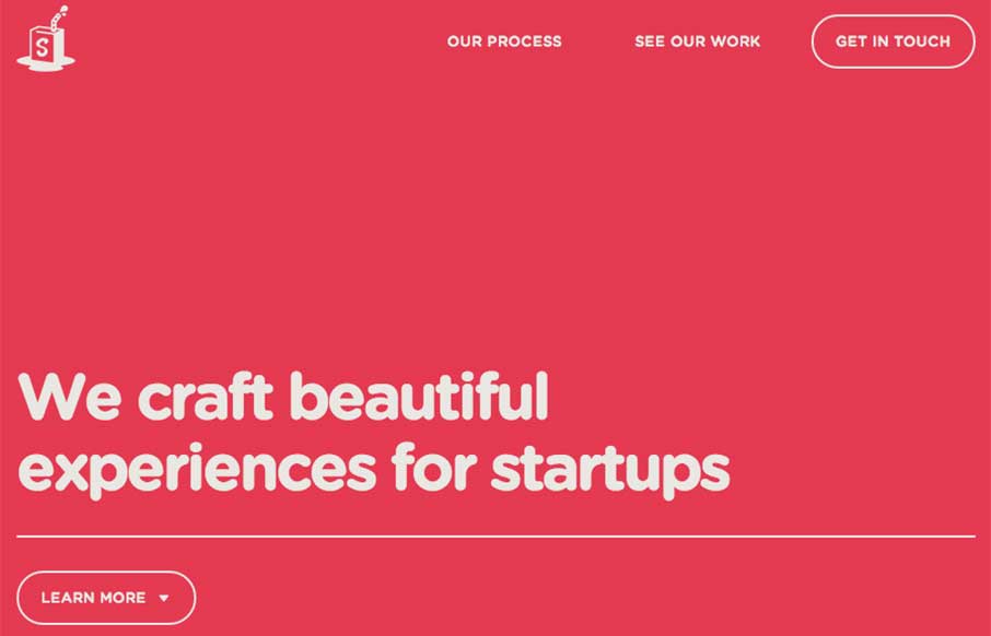
You know I like simple websites – Simple as Milk, an agency out of Eastbourne, UK keeps to their name – which is always good! I want to say they have made some slight changes since I first looked at their site – changing up the home page coloring and some messaging too. Really like the illustrations on the Our Process page – and the hint of animation when scrolling through the portfolio. Cheers!
Glassmorphism: The Transparent Design Trend That Refuses to Fade
Glassmorphism brings transparency, depth, and light back into modern UI. Learn how this “frosted glass” design trend enhances hierarchy, focus, and atmosphere, plus how to implement it in CSS responsibly.


Site working very smooth & look transparent.