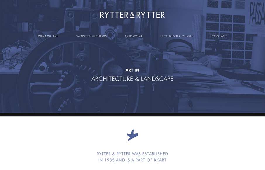
Pretty clever single page layout for Rytter & Rytter. I like the way the sections are laid out as you scroll down, the flow feels nice. My favorite section is the pictures of their work, the way they’re cataloged and displayed is just clever.


Glassmorphism: The Transparent Design Trend That Refuses to Fade
Glassmorphism brings transparency, depth, and light back into modern UI. Learn how this “frosted glass” design trend enhances hierarchy, focus, and atmosphere, plus how to implement it in CSS responsibly.


0 Comments