Submitted by Ryan Johnson, @ryanjohnson_me. Designer & Developer.
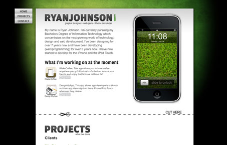
I’m still not sold on the “single page layout” style of websites, this one works pretty well though. The navigation follows you as you scroll down the page, I’ve seen that before and it seems like the best way to keep the user informed of how to navigate. The contact form is HUGE, not sure if that’s the best here, it certainly fills the screen well enough. Overall the design and layout of the elements in the content sections is well done and I like the minimalism of the site.


Nice single layout, the white container looks nice on the green/black background, works well.