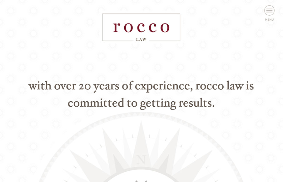
We’ve seen and built hundreds of law sites – so always interested to see other’s takes lawyer sites. This one for Rocco Law out of Philadelphia, built by Blinebury Design – is very good. It’s the small things that get me – besides the compact color scheme, with good texture underneath – I like the usage of the sun/compass in the background, and in the pre-loader.
Also, the thought to use the word “menu” below, then next to the hamburger… hey designers – you may think that the hamburger icon is the most ubiquitous thing on earth – but not all internet / website users are web designers – visual and overt clues are sometimes a good thing.
From the Designer: Blinebury Design worked with boutique law firm Rocco Law to create sophisticated branding that incorporates iconography from Philadelphia landmarks like City Hall. These patterns are woven through the clean, typographic-heavy custom WordPress website. The site is fully responsive and highlights the Philly firm’s practice areas including personal injury & workers’ compensation. Our goal was to create a unique website design for an industry filled with cookie-cutter website templates.
Submitted by: Beth Blinebury
Twitter: @bethblinebury
Role: Designer & Developer
Country: United States


0 Comments