redup.co.uk

redupcouk

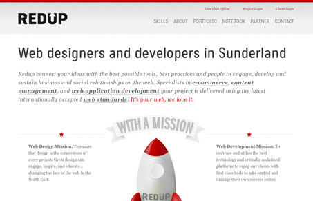
I really like the light touch this website design seems to have. It feels open and airy while at the same time it’s fairly dense with content. The illustrations are super great, love the rocket ship! I also like how the home page is designed like a long scrolling single page site but then as you click through you find there are many pages to this website and it’s all new(ish) content there to engage you. Good stuff!

1 Comment

  1. John Williams

    I like the illustrations, but I think the site has way too much copy.

    Reply

Submit a Comment

Your email address will not be published. Required fields are marked *

Time limit exceeded. Please complete the captcha once again.

News & Articles

Website Scanning Patterns for Maximum Engagement

Website Scanning Patterns for Maximum Engagement

Discover how users visually process websites, the role of scanning patterns, content placement, and “the fold” Learn to design engaging pages with fast-to-consume content that aligns with user behavior.