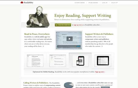
Nice clean well designed website. I love the typography, it feels so classic to me, very much like A List Apart looks. That simplistic but super well done type layout goes such a long way to timelessness. It’s great. Make sure you check out the sign up page too, I like how the amount field has the call out that helps sell the overall idea at the same time. The blog is also stripped down, much like the product promises it will do, very smart.


0 Comments