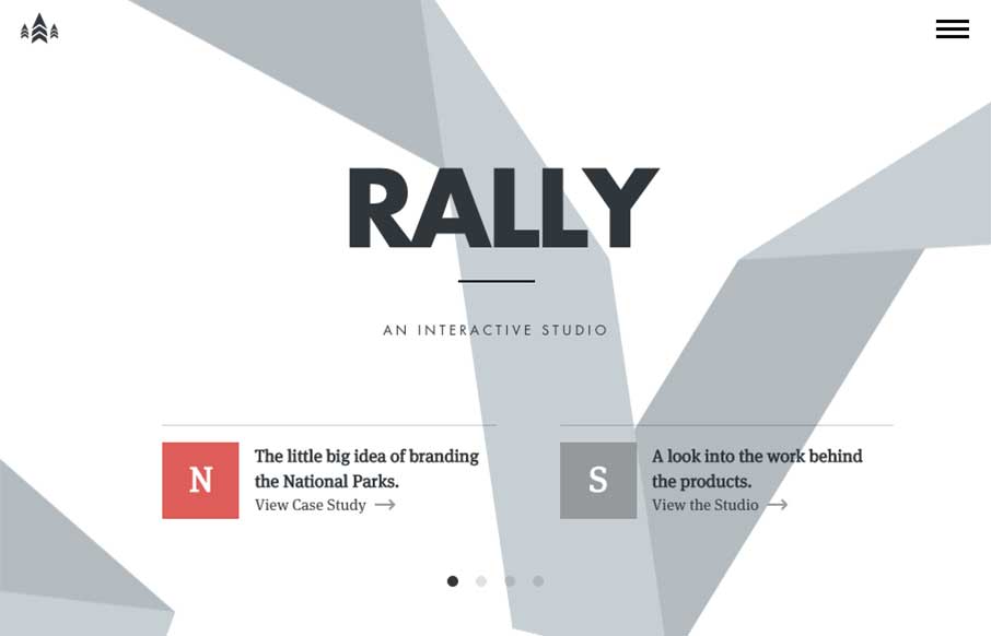
I love just about everything there is about the Rally website. The main “hero” area, not sure what to call this area anymore really, is super dope. The “ribbon” graphic is very nicely executed, even when you scale the screen down the ribbon stays relevant. I love how the section to section transitions work both technically and content organization wise. Such a smart fresh site.


The Call to Action, Revisited
The Call to Action hasn’t changed in a decade, but the bar has. A fresh look at prominence, copy, mobile tap targets, and accessibility, with lessons from three major design systems.


0 Comments