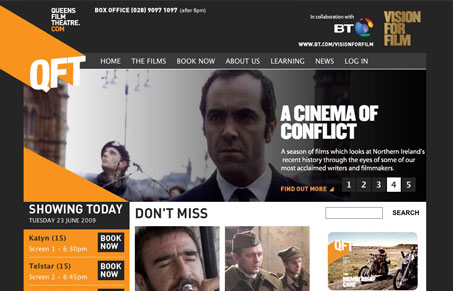
The way the logo is designed onto the page is very dynamic and really forces you to scan right into that main header block. The dark background also accentuates this tracking movement somehow. I think the top half of this site is the strongest visually, as you move down the page it sort of starts to fall apart, as you scan the elements it’s almost a sort of information graduation effect.
Glassmorphism: The Transparent Design Trend That Refuses to Fade
Glassmorphism brings transparency, depth, and light back into modern UI. Learn how this “frosted glass” design trend enhances hierarchy, focus, and atmosphere, plus how to implement it in CSS responsibly.


0 Comments