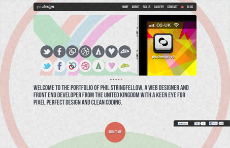
I think what is most compelling about this website design is the use of the large ring shapes in the background. They kind of hug the pages/sections and make it visually interesting as you glide down the page. The background texture is really nice too.


Thanks for mentioning my site on Unmatched Style 🙂