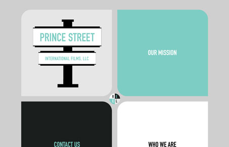
Princestreetfilms.com is a site that embraces the simple. This one pager breaks the space into quadrants for different content types instead of having multiple pages. Each ‘link’ triggers a slider that reveals the hidden content. It’s an interesting user experience and I don’t mind the hiding of content because the interface is so simple and easy to understand. I know, with reasonable certainty, how to get to the content. One little thing is the REEL button. I know that creation of the reel is still underway but the button is a little too overwhelmed by the large blocks of color that surround it. Other than that, the site is a cool meditation on simplicity.


I think the simplicity of this site works well. However, I actually think that if you show all of the content it becomes a more attractive site. The type is laid out well and is easy to read.
Also, although the little reel button is centered in the middle of the ‘streets’, it’s far too insignificant for such an important part of this site. I really think the most important part for a film company would be the actual work that they do. Like Giovanni noted, after clicking on the reel button, you’re presented with some ‘coming soon’ text. Perhaps with the crossing streets theme, they could have had some yellow and black lines with construction barriers?