
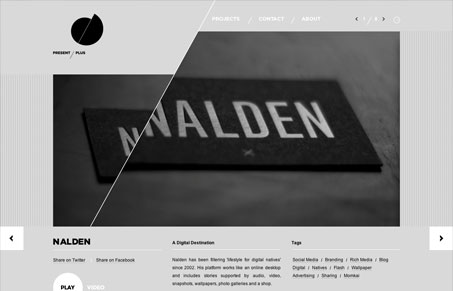
Interesting design with the strong diagonal. It comes through pretty much half the page and splits the image in two as well. The diagonal creates a really nice strong visual that feels as dynamic as it is visually interesting. It’s a play on the logo design as well which shows how thorough the thought is.




0 Comments