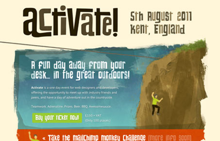
Sign. Me. Up. This is a super fun looking site for an upcoming outdoor adventure for web designers and developers. There’s a lot packed in this little site to comment on, so in no particular order:
- The color scheme rocks my Merrell’s off.
- The main typeface is fun, graphic, and helps section off the content well.
- Simple, painterly illustrations pull off the “outdoorsy” look perfectly.
- There’s a guy on a zip line flying across my screen, and another swinging up among the pine trees. What more do you need to motivate you to “Activate?!”
It looks like there will be more added to the site as the event’s plans are finalized. I’m gonna have to check back to find out what the MailChimp Monkey Challenge is!
Review by: Maria Frey
@mariafrey | mariafrey.com


0 Comments