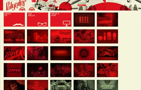
This semi-responsive layout is very cool. I love the way the grid design on the home page works with the sub content. You very easily learn how the website works and navigates after clicking just one of the links. You are also rewarded as a user with a pretty neat experience in way the site works visually too. I love the red and black coloring too. Very stark yet warm and inviting in it’s spirit. Great stuff here!


0 Comments