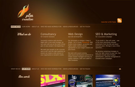
As these long single-page websites go this one is pretty nice. I like the colors, using the brown/orange and lighter/more saturated shades of the same give the background an eerie boggy look that I quite like. The background image itself looks a little muddied up with the way it tiles though. I’ve seen sites like these before and I like the smooth scrolling action that this one lacks, the jerkiness of being thrown around to the anchored positions bothers me a little. Over all though this is a nice looking design and just a couple of small tweaks would make it really shine through.
Glassmorphism: The Transparent Design Trend That Refuses to Fade
Glassmorphism brings transparency, depth, and light back into modern UI. Learn how this “frosted glass” design trend enhances hierarchy, focus, and atmosphere, plus how to implement it in CSS responsibly.


0 Comments