
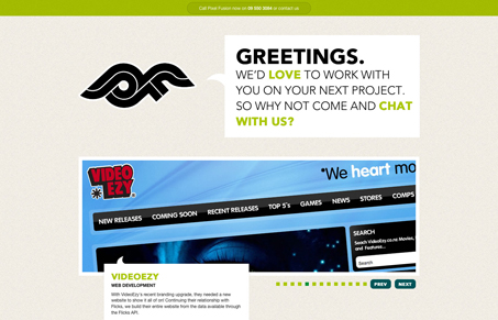
I like the way the different sections of this home page are done, the central element is the big slideshow and then more stuff as you scroll down the page. It’s a single page site, largely static with the exception of that slideshow. I like the green and the background color here. The main header area looks nice, but it might be a tad confusing that you can click it, it does change out the text but I did expect it to load a different page altogether.




0 Comments