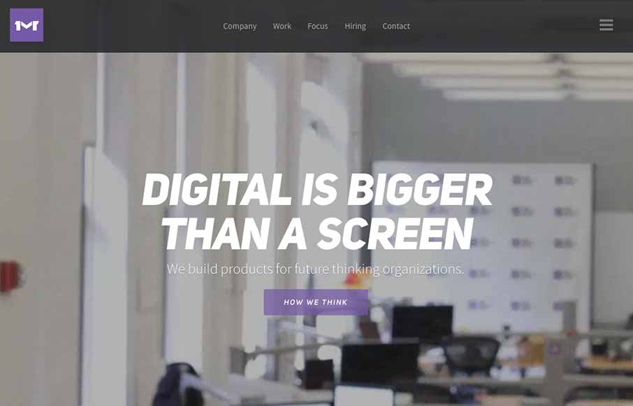
I like the first pass minimal look to the One Mighty Roar website. However once you start to click through the site you find that the pages are lengthly and deep with content and imagery. I also like how they’ve used the hamburger icon to show you what’s beyond the main navigation links instead of just to hide the nav to keep it more minimal feeling.
Looking Fast: The Art of Website Speed Perception
In the web world, technical speed and user perception matter. By improving design for a faster appearance, you boost conversions and stand out online. Speed isn’t just loading time; it’s perception.


0 Comments