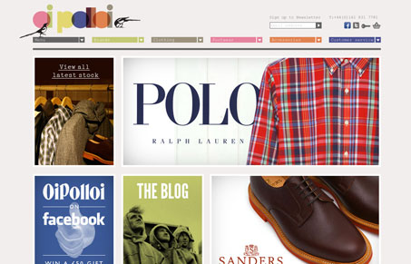
A simple way to sort and view products. Everything arranged in a big grid. Nice bold coloring and clear sections. I really like this layout for browsing and sorting, you just can’t beat a simple mechanic like this. Nice colors and the birds add good character too.


Love how this site really has a style of it’s own. I think the great color palette and simplicity of the layout echo the relaxed but stylishness of the clothing / potential customer.
As someone who shops online a lot I also appreciate the product availability in the hover state. The only criticism I might have is that there’s probably too many boxes on the homepage.