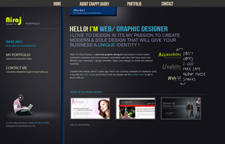
This is an interesting site design. It comes off like it’s way more interactive than it actually is, it’s quite straight forward and simple in this sense. I like that about it, it could easily be made to have more interactive trends thrown in, but it doesn’t need it and I respect the designer’s restraint. I quite like it.


0 Comments