
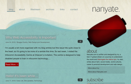
Love the textures and really love the colors. The red and the pattern in the, what I assume is a light of some kind, in the top right illustration under the logo is superb. I love the richness in this design, even though the rest of the colors and textures kind of blend together it just has a nice deep quality to it.




0 Comments