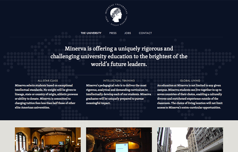
I like the patter of going dark to light with a top down design for websites like this. It makes the transition into more dense content very palatable to me for some reason. The way the navigation get’s fixed as you scroll down the page on this site is a nice touch too. It really doesn’t even feel like a single page design, in fact I had to go back and double check to make sure I was right. Super nice responsive design solution too.
Glassmorphism: The Transparent Design Trend That Refuses to Fade
Glassmorphism brings transparency, depth, and light back into modern UI. Learn how this “frosted glass” design trend enhances hierarchy, focus, and atmosphere, plus how to implement it in CSS responsibly.


0 Comments