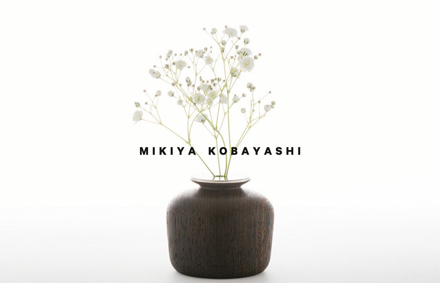
Love the movement and design of this site for Mikiya Kobayashi out of Tokyo. Kobayashi’s design work is beautiful, and the site really shows all of it off well. I don’t always like the double off-screen / hamburger nav, but they only use it for the Projects page here, so very appropriate. I kind of think you could spend an hour here looking at all the work, which was the point of the site right?


The Call to Action, Revisited
The Call to Action hasn’t changed in a decade, but the bar has. A fresh look at prominence, copy, mobile tap targets, and accessibility, with lessons from three major design systems.


0 Comments