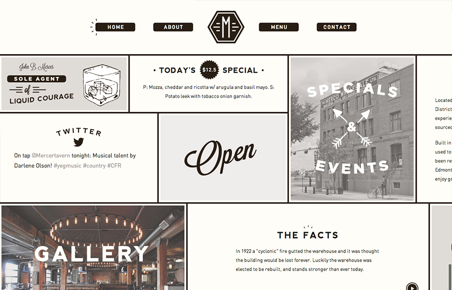
Interesting single page design. It scroll sideways which gives it an extra push of into making if “feel” really graphic. Not sure that makes sense, but it did in my head. I’m not normally a fan of tricks like this side scroll design here. But for some reason it just feels like it works to me. Maybe it’s the strong lines on the newspaper like feel and the stark graphic type mixture and black and white. Don’t know but I like it. What do you think?


The Call to Action, Revisited
The Call to Action hasn’t changed in a decade, but the bar has. A fresh look at prominence, copy, mobile tap targets, and accessibility, with lessons from three major design systems.


0 Comments