Mercer Tavern

http://mercertavern.com/

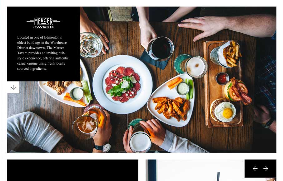
The majority of restaurant websites are awful. Period.  Mercer Tavern’s website on the opposite side of the spectrum. They prove that you can make a great restaurant website, that is clean, cool, and small. The pictures make the site cool, and the literal white space makes the rest of the site. They also show you how to do a single page website, without having the user scroll forever. And you know what, it makes me want to visit Mercer Tavern next time I’m in Edmonton (which is the real purpose of a website, right?).

Submitted by: Shaun Brandt @onstcreative
Role: Designer

Working together with designer Dan Cassaro, We wanted to create a brand and digital presence that was clean, simple, and true to the era of the famous Mercer Warehouse.

0 Comments

Submit a Comment

Your email address will not be published. Required fields are marked *

News & Articles

Looking Fast: The Art of Website Speed Perception

Looking Fast: The Art of Website Speed Perception

In the web world, technical speed and user perception matter. By improving design for a faster appearance, you boost conversions and stand out online. Speed isn’t just loading time; it’s perception.

Designing for Errors: Creating User-Friendly Contingency Plans

Designing for Errors: Creating User-Friendly Contingency Plans

Contingency Design hinges on empathy, understanding user frustration, and transforming errors into positive impressions. By embracing these principles, you enhance user experiences, retain customers, and boost revenue in the competitive digital landscap