matthewnsara.com

matthewnsaracom

Submitted by Matt Sanders, @mattsanders. Designer & Developer.

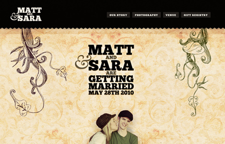
Well, this is a website for my upcoming wedding. I think it has some good uses of typography and textures. We also added some silly humor to the mix.

Pretty good wedding website. I like the simplicity of it and the texture the illustrations bring to the design. Nice use of @font-face too.

0 Comments

Submit a Comment

Your email address will not be published. Required fields are marked *

News & Articles

Sign-Up: Enhancing Conversions through good UX

Sign-Up: Enhancing Conversions through good UX

Optimize your website’s sign-up process by focusing on clarity, ease, and user mindset. Clearly explain the purpose, benefits, and steps, and use social proof to build trust and drive conversions.

The Essential Guide to Getting Started on Freelance Writing

The Essential Guide to Getting Started on Freelance Writing

Explore the lucrative and fulfilling world of freelance writing with our essential guide. Learn about specialties like blogging, social media, article, and technical writing. Build a portfolio, find work, set up your business, and discover the potential earnings. Embrace the freedom of working from home and follow tips for success in your dream career.