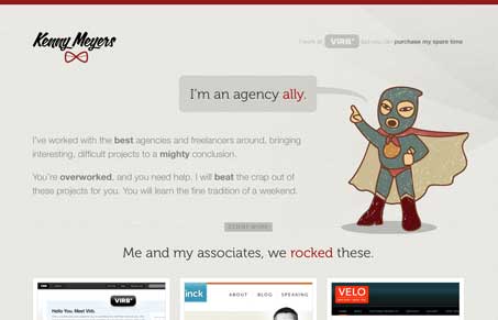
I love this site, the subtle textures, wonderful typography and the illustration is pretty cool. I love the @font-face use here and flow from work samples to form makes this one of the better single page site’s i’ve seen. I really dig how he’s showing where the work was done with the little corner icons and the copy on this site is just right on target for the audience. It’s hip, not overly so, and really speaks to people like me who run a web design studio. Really great little site here!
Glassmorphism: The Transparent Design Trend That Refuses to Fade
Glassmorphism brings transparency, depth, and light back into modern UI. Learn how this “frosted glass” design trend enhances hierarchy, focus, and atmosphere, plus how to implement it in CSS responsibly.


This is so nice to see and thank you so much!
The design was done by Matt Anderson: http://matthew-anderson.net/ and he deserves most the credit.