
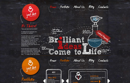
Cool conceptual design. I like the chalkboard idea here, everything looks like it’s written on the board. The background image gives it a lot of depth and really helps sell the idea. The design on top is tight and well ordered. The single page scroller design also lends itself well to the chalk board concept here too.




0 Comments