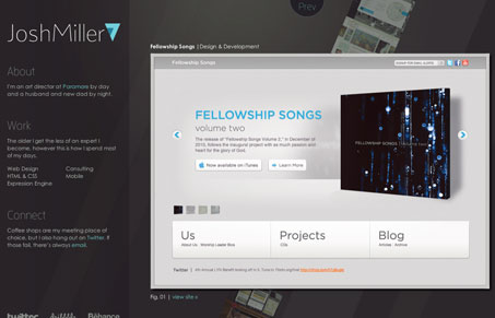
This is why I love Dribbble. This shot appeared in my following list today and it’s seriously a clever bit of web design that I might not otherwise have seen. Josh Miller states:
“So, here’s my first personal site. After seven years of making sites, apps, display and emails for everyone else, I finally did something for myself.”
Talk about setting the bar high!
I absolutely love the simplicity of this site. Let me rephrase. It takes a simple concept of displaying work and presents it in a complexly simple way. Oxymoron, yes. Just go to the site for yourself and see. The angled work ties in beautifully with the overall feel and branding of Josh Miller. The illusion of depth adds a ton of interest and is something you don’t see everyday. This is a site I’d like to spend time poking around under the hood of. No doubt there’s some CSS and jQuery wizardry going on. This page really draws your attention and makes you want to interact with it. Well done!
Review by: Maria Frey
@mariafrey | mariafrey.com


0 Comments