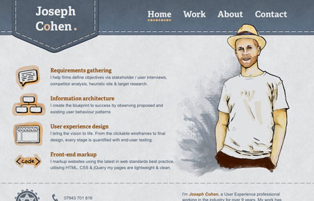
The thing I like the most about this website design is the icons on the left-hand side of the page. Those are just so warm and fun with the watercolor effect. Also, I really love this trend of heavily illustrated designs making the submission pool here.


0 Comments