Imbue Labs

http://imbuelabs.com/

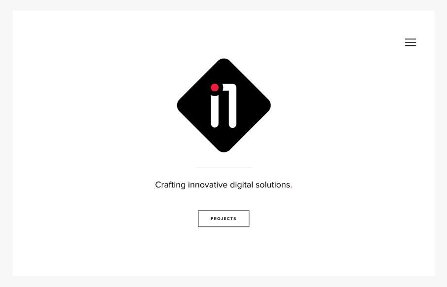
Very nice minimal approach. I’d say it’s “minimal” done right. I love that there’s a singular focus on that “projects” button, then you can explore from there, but that’s the main thing. It’s very clean and clear and I just love it.

From the Designer:

We wanted to design something very clean for our new, 2-man web design & development shop. Our focus was on simplicity throughout the website, with a few little thrills like an animated SVG on the home page.

We’re still finding things to improve every day based on the feedback we get, but we’re currently happy with how it turned out.

Submitted by:Ionut Iacob
Twitter: @johnalexjacob
Role: Designer & Developer
Country: Romania

0 Comments

Submit a Comment

Your email address will not be published. Required fields are marked *

News & Articles

Sign-Up: Enhancing Conversions through good UX

Sign-Up: Enhancing Conversions through good UX

Optimize your website’s sign-up process by focusing on clarity, ease, and user mindset. Clearly explain the purpose, benefits, and steps, and use social proof to build trust and drive conversions.

The Essential Guide to Getting Started on Freelance Writing

The Essential Guide to Getting Started on Freelance Writing

Explore the lucrative and fulfilling world of freelance writing with our essential guide. Learn about specialties like blogging, social media, article, and technical writing. Build a portfolio, find work, set up your business, and discover the potential earnings. Embrace the freedom of working from home and follow tips for success in your dream career.