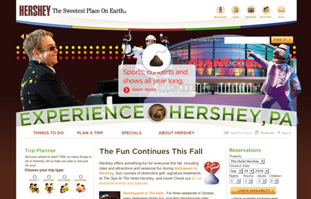
This is just a fun looking site design. I like the half circle treatment, I’m not too hip on the over worked flash section but it works an is expected for a big(ish) destination brand like this I think. The page’s sections are nicely tucked in and feel’s well spaced. Good clean site here.
Microinteractions
Microinteractions are subtle site animations enhancing engagement. They include triggers, rules, feedback, and sometimes loops/modes. Practical uses: improving engagement, guiding user behavior. Well-designed microinteractions boost user engagement and your online presence.


The curvature of the masthead really makes the site stand out. I’m not sure why there are some many different link colors in the navigation menu and I’m not really a fan of the tab effect for section headings on some pages.
I know that the chocolate brand and the city are closely connected, but for me it’s too heavily branded with the chocolate imagery. It’s harder to tell that it’s a presumably city-owned site and not a company-owned one.
I agree with you Tim, I’ve always thought it was weird how the town so strongly attached it’s brand to Hershey’s Chocolate. It’s like there’s nothing else there…