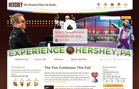
This is just a fun looking site design. I like the half circle treatment, I’m not too hip on the over worked flash section but it works an is expected for a big(ish) destination brand like this I think. The page’s sections are nicely tucked in and feel’s well spaced. Good clean site here.
Looking Fast: The Art of Website Speed Perception
In the web world, technical speed and user perception matter. By improving design for a faster appearance, you boost conversions and stand out online. Speed isn’t just loading time; it’s perception.


The curvature of the masthead really makes the site stand out. I’m not sure why there are some many different link colors in the navigation menu and I’m not really a fan of the tab effect for section headings on some pages.
I know that the chocolate brand and the city are closely connected, but for me it’s too heavily branded with the chocolate imagery. It’s harder to tell that it’s a presumably city-owned site and not a company-owned one.
I agree with you Tim, I’ve always thought it was weird how the town so strongly attached it’s brand to Hershey’s Chocolate. It’s like there’s nothing else there…