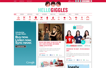
Neat 3 column blog design. I like some of the details like the logo when you mouse over it. The main navigation should make an icon lovers day. Overall everything appears to be kept consistent visually, which is sometimes tough with a blog that has a lot of posts like this one.


0 Comments