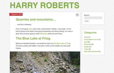
New version of Harry Robert’s site. Harry’s style is always clean and minimal. I really like this more simplified version of the site. Doing a minimal design isn’t as easy as it looks since you need to make sure the elements you’ve actually left on the page are top notch.
Harry you should consider releasing this theme to the public man! I know i’d love to use something like this myself.


0 Comments