getsatisfaction.com

getsatisfactioncom

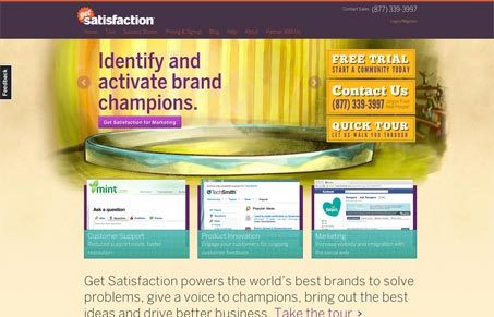
Nice design update for getsatisfaction.com. I really like the background image with the text based slideshow on top of it. I love the three screenshots that enlarge as you mouse over them.

I do however think the page is missing a really clear and simple call to action. The three gold(ish) buttons do stand out, but they are three different paths that you can take off into. That might be their purpose – I lack the insights that the site’s designers have but playing armchair designer here, that’s what I see and what my gut is telling me about it.

0 Comments

Submit a Comment

Your email address will not be published. Required fields are marked *

News & Articles

Looking Fast: The Art of Website Speed Perception

Looking Fast: The Art of Website Speed Perception

In the web world, technical speed and user perception matter. By improving design for a faster appearance, you boost conversions and stand out online. Speed isn’t just loading time; it’s perception.

Designing for Errors: Creating User-Friendly Contingency Plans

Designing for Errors: Creating User-Friendly Contingency Plans

Contingency Design hinges on empathy, understanding user frustration, and transforming errors into positive impressions. By embracing these principles, you enhance user experiences, retain customers, and boost revenue in the competitive digital landscap