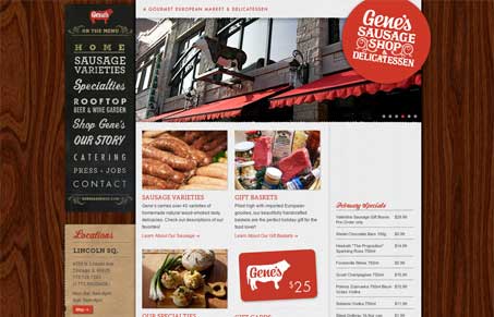
Naming aside, I really like this site. I like how the navigation is all different type treatments, normally this just wouldn’t work, but in this scenario it totally does and it’s enjoyable at the same time. It’s the branding that enables this, you get a really clear sense of what it’s like to go into the store through the site – and that’s not easy to do design wise. There are also some neat little surprises in the content too, like on the sausage varieties page, those chalk drawings are just nice. Great site here.


0 Comments