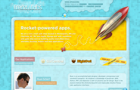
Frenzy Labs is the company behind SixCentral.
It’s a single page style design for their website, in the case of Frenzy Labs who really focus heavily on the development of their own products this site works perfectly. Not to mention it really is quite nice looking. The background is unique and I really like the pixelated feel of the blocks. Overall it does a nice job of laying out who’s behind the company and connects you with their twitter profiles quickly.


As they say, their work is pretty adorable. I do like the pixelated background but it almost brings down legibility on the intro copy. I was just looking at the photos and wishing that they had a photo treatment on them that matched the site more (stronger color/contrast).
I have to note that under “Get Updates” they wrote “Alot” as one word and it’s bothering me big time!
@julie, totally agree.
This is a good example of a site where someone is using some real photoshop skills and even a good handful of html/css skills to produce a very interesting website. However, there are core design principals that seem to have been overlooked. This is a great example of a site that lacks that last push.
I see it in the logo area. I see it in the lack of readability/legibility throughout the page. I see it in the transparency, it’s “neat”, but what purpose is it serving?
Frenzy Labs background is a rip of http://product-support-staples.com