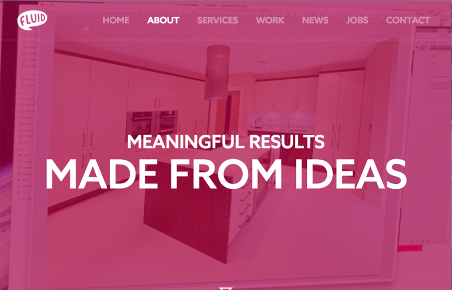
I can really appreciate the simple approach to this site design. Just big bold areas of content and imagery. I love the way the interaction on the main nav works. Graying out the nav items that you’re not mousing on. Good thinking there on the UI.


The Call to Action, Revisited
The Call to Action hasn’t changed in a decade, but the bar has. A fresh look at prominence, copy, mobile tap targets, and accessibility, with lessons from three major design systems.


0 Comments