fargobrewing.com

fargobrewingcom

First off the main wrapper dive is called “Beer” that’s awesome… 🙂

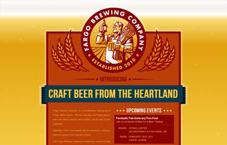
Love the background, the bubbling beer actually makes me want one. Visually the brand is super strong, the colors and type are perfectly chosen as well. I’m a little disappointed it’s just a single page though, I would love to see what this site would become with more pages/depth to go through.


fargobrewingcom

First off the main wrapper dive is called “Beer” that’s awesome… 🙂

Love the background, the bubbling beer actually makes me want one. Visually the brand is super strong, the colors and type are perfectly chosen as well. I’m a little disappointed it’s just a single page though, I would love to see what this site would become with more pages/depth to go through.

Kinsta

2 Comments

  1. Allen Blodgett

    Im guessing that the only reason its a one pager right now is because the company was started last year…

    Reply

Submit a Comment

Your email address will not be published. Required fields are marked *

Time limit exceeded. Please complete the captcha once again.

News & Articles

Fitts’s Law: Why the Easy Button Wins

Fitts’s Law: Why the Easy Button Wins

Large, close targets are faster to hit than small, distant ones, that’s Fitts’s Law. A look at the 1954 rule behind buttons, prime and magic pixels, thumb zones, and dark patterns.

The Call to Action, Revisited

The Call to Action, Revisited

The Call to Action hasn’t changed in a decade, but the bar has. A fresh look at prominence, copy, mobile tap targets, and accessibility, with lessons from three major design systems.
