FABRIK

http://fabrik.co.jp/

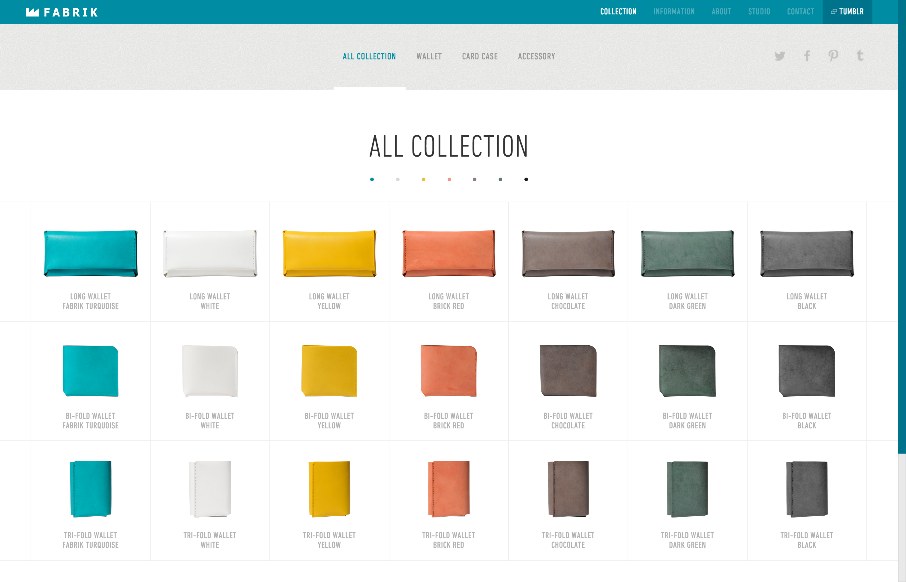
I love the straightforward minimal approach of this site, coupled with it’s easy to use interface for filtering by product type and color it brings me closer to the product than most other product pages I visit. The grids of colorful rows are just magical in drawing me in.

fabrik.co.jp

The content accordion that drops out with large images does more to pull me in, as if clicking on the item was akin to picking it up and casually looking it over.
I appreciate a good shopping experience, and often they are hard to come by for me personally, just ask my wife.

@FABRIK_Tokyo

0 Comments

Submit a Comment

Your email address will not be published. Required fields are marked *

News & Articles

Sign-Up: Enhancing Conversions through good UX

Sign-Up: Enhancing Conversions through good UX

Optimize your website’s sign-up process by focusing on clarity, ease, and user mindset. Clearly explain the purpose, benefits, and steps, and use social proof to build trust and drive conversions.

The Essential Guide to Getting Started on Freelance Writing

The Essential Guide to Getting Started on Freelance Writing

Explore the lucrative and fulfilling world of freelance writing with our essential guide. Learn about specialties like blogging, social media, article, and technical writing. Build a portfolio, find work, set up your business, and discover the potential earnings. Embrace the freedom of working from home and follow tips for success in your dream career.