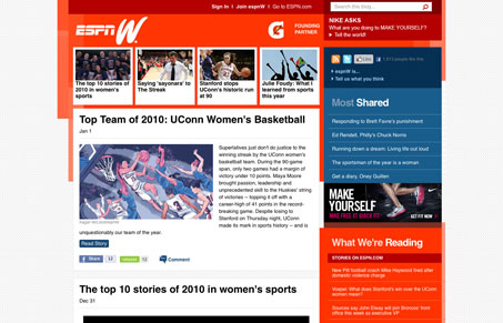
This sports blog pretty much matches up with the overall ESPN visual style. The bold red and blue colors make it visually loud. But since it’s focus is much narrower than the main site it can be much more toned down content wise, which is really nice. I like the background pattern and I like how many of the boxes are kind of layered and staggered. The top 4 white boxes, for featured stories I guess, really help rocket your eye down into the meat of the content. I tend to ignore much of what’s in the sidebar, particularly the stuff in the blue sections though.
Glassmorphism: The Transparent Design Trend That Refuses to Fade
Glassmorphism brings transparency, depth, and light back into modern UI. Learn how this “frosted glass” design trend enhances hierarchy, focus, and atmosphere, plus how to implement it in CSS responsibly.


0 Comments