espnw

espnw

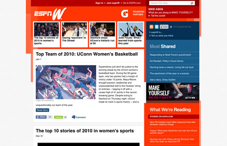
This sports blog pretty much matches up with the overall ESPN visual style. The bold red and blue colors make it visually loud. But since it’s focus is much narrower than the main site it can be much more toned down content wise, which is really nice. I like the background pattern and I like how many of the boxes are kind of layered and staggered. The top 4 white boxes, for featured stories I guess, really help rocket your eye down into the meat of the content. I tend to ignore much of what’s in the sidebar, particularly the stuff in the blue sections though.

0 Comments

Submit a Comment

Your email address will not be published. Required fields are marked *

News & Articles

Looking Fast: The Art of Website Speed Perception

Looking Fast: The Art of Website Speed Perception

In the web world, technical speed and user perception matter. By improving design for a faster appearance, you boost conversions and stand out online. Speed isn’t just loading time; it’s perception.

Designing for Errors: Creating User-Friendly Contingency Plans

Designing for Errors: Creating User-Friendly Contingency Plans

Contingency Design hinges on empathy, understanding user frustration, and transforming errors into positive impressions. By embracing these principles, you enhance user experiences, retain customers, and boost revenue in the competitive digital landscap