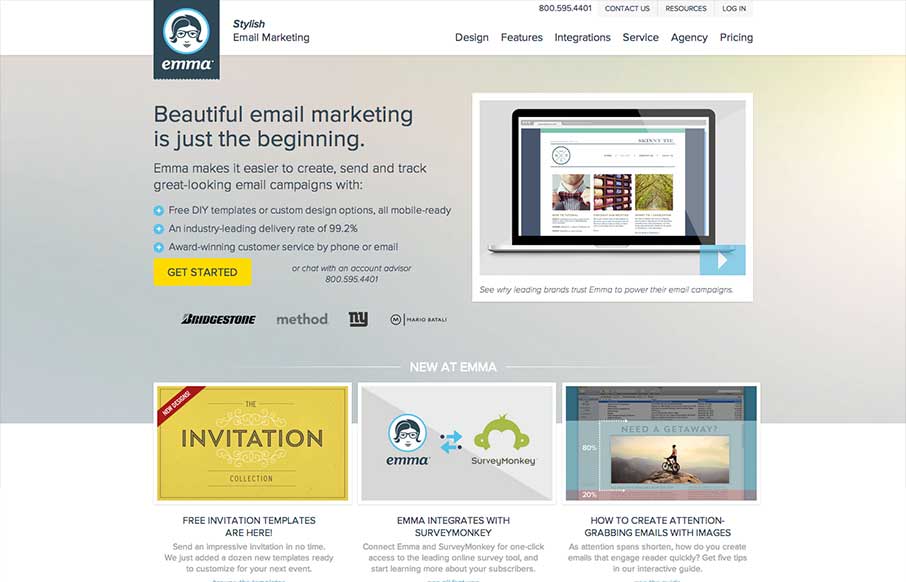
There’s a lot going on with this website design. There are so many different nav items and little things that you can click on, in a lot of ways it suffers the same issues that most big product websites do: too much stuff. They do a good job with keeping the call to action clean with the simple yellow button. I do really like how the nav slides into place and becomes a fixed asset with a call to action as you scroll or make your way through other sections of the site. There is a lot of really great layout happening across the pages of this website too.
Glassmorphism: The Transparent Design Trend That Refuses to Fade
Glassmorphism brings transparency, depth, and light back into modern UI. Learn how this “frosted glass” design trend enhances hierarchy, focus, and atmosphere, plus how to implement it in CSS responsibly.


0 Comments