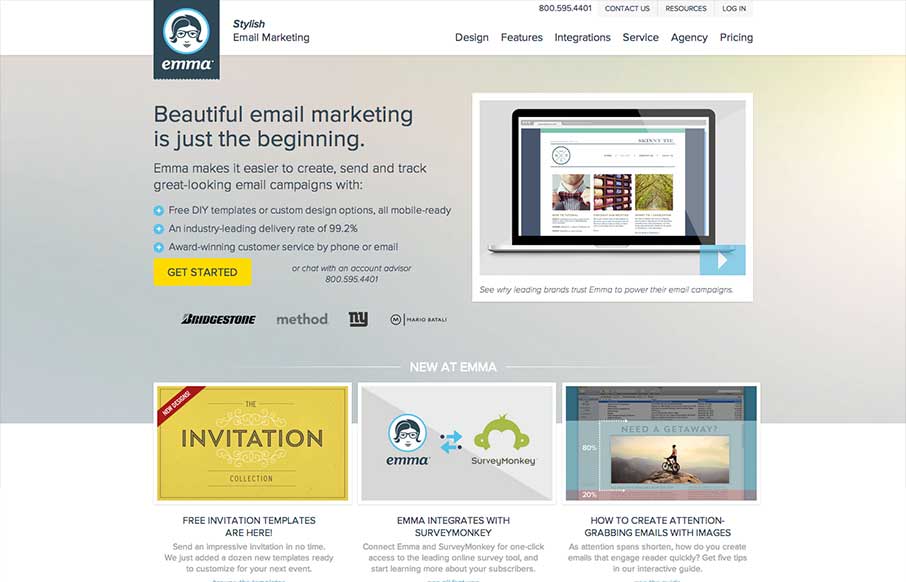
There’s a lot going on with this website design. There are so many different nav items and little things that you can click on, in a lot of ways it suffers the same issues that most big product websites do: too much stuff. They do a good job with keeping the call to action clean with the simple yellow button. I do really like how the nav slides into place and becomes a fixed asset with a call to action as you scroll or make your way through other sections of the site. There is a lot of really great layout happening across the pages of this website too.
Looking Fast: The Art of Website Speed Perception
In the web world, technical speed and user perception matter. By improving design for a faster appearance, you boost conversions and stand out online. Speed isn’t just loading time; it’s perception.


0 Comments