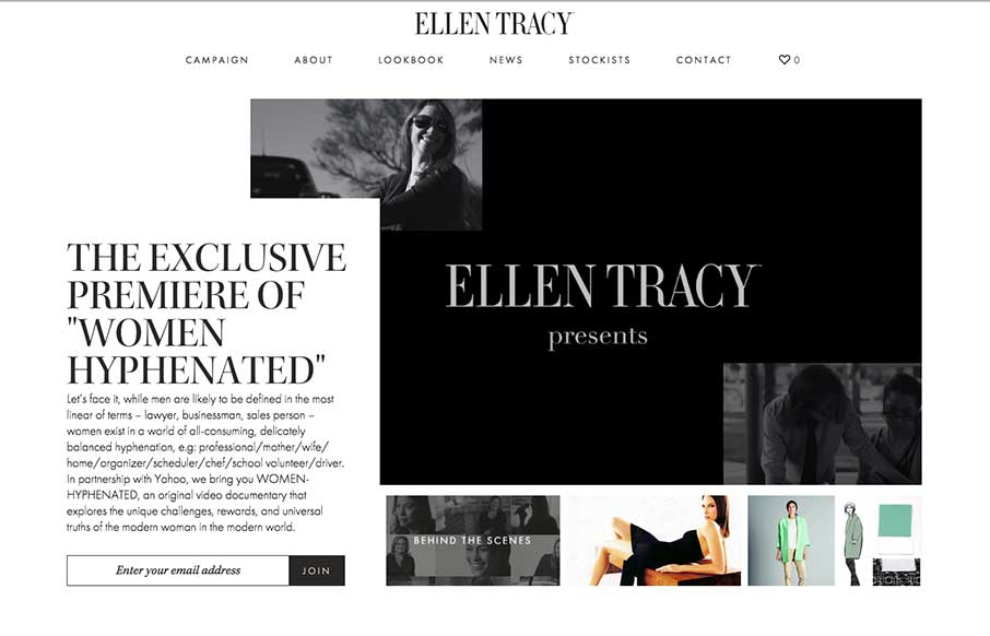
High fashion is followed by slick design in this site for Ellen Tracy, done by The Charles NYC. I already like the work that The Charles does (like the Bloomberg Media site we reviewed a little while back) – so when they submitted this site, I was looking forward to it. And was not let down.
I still love sites that use a white / black / grey canvas, and let their imagery or photo do the heavy lifting like this site does. The work on the LookBook, both the main page and the detail modals are smart – in layout and marketing. The only thing I might change is the video loop on the Home page – maybe a mute button – or have it stop looping after you scroll down – I want to be free to enjoy the rest of the home page too. That aside, and personal preference, the site is pretty darn sweet.
From the Designer: ‘The Charles NYC worked with Ellen Tracy to translate the brand’s legacy and iconic image archive into a rich digital experience. Designed to provide an optimized experience across devices, the fully responsive and feature-loaded website gives visitors an insight into the lifestyle of the modern, multifaceted Ellen Tracy woman.’
Submitted by: The Charles NYC
Twitter: @thecharlesnyc
Country: USA


0 Comments