With the new Bloomberg Business website that launched a couple of weeks ago (which we made some observations here), well it looks like the media giant also has a separate site for the media / advertising / marketing sales division – Bloomberg Media (BBM). We thought that with all the radical changes to the Bloomberg Business site, it was interesting to see how a large company like this handles different divisions’ sister sites – especially when they are designed with outside resources (as this site was done). So we thought we’d go a little more in depth with this site, because it stands out on it’s own merits too.
From the Designer:
Designed by The Charles NYC, the aesthetic for bloombergmedia.com draws inspiration from the Bloomberg Terminal’s iconic low-fi color palette and typography, combined with a visually rich digital experience that highlights the immense range of content. Strategically designed to engage the new generation of media planners, The Charles broke out of traditional grid layouts to creatively showcase Bloomberg Media’s rich multimedia and multi-platform offering without compromising on technical detail and interactive functionality.
So – understanding that Bloomberg really uses this site to inform media planners and potential advertisers of Bloomberg’s full offerings, it would stand to reason that they need to present the Bloomberg’s full portfolio, stats to back up the portfolio, editorial calendar info for planning – and do it in a way that is engaging, and keeps to good, innovative design.
Starting from the top… looks like BBM accomplishes this really from head to to (or footer).
Navigation

I’m sure the information architecture for this project was pretty interesting on it’s own, so I like the decision to have the drop-down menu. Also find it interesting (in a good way) that for a site that is very video rich and vibrant, that they went with flat icons / boxes – think it makes the navigation more simple, boiled down to good “chunks” of information, thus better and more informative for the user (instead of having a mega-drop-down). There’s also a lot of use of svg’s all over the site, but a bit of svg viewBox in the drop-downs too.
Hero Video Background
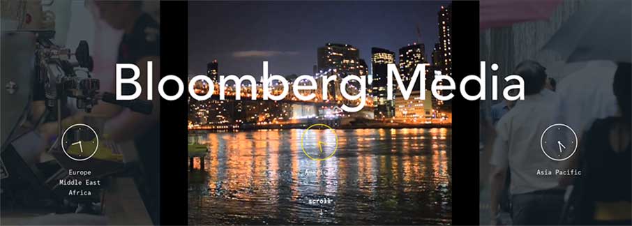
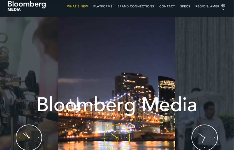
Now this is pretty cool – it’s three different video backgrounds – only one is in use at any one time (saving your CPU a little). As you hover over the different time zones, the video background for that area starts to play, leaving the other two zones neutral.
CSS Animation & Stats
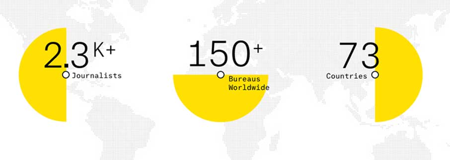
Gotta get the stats in here if you want to sell some space on a website or 5. Good use of a little CSS animation on the home page to draw the eyes in to what I’m guessing are some the main stats would start to pique interest of media planners / advertisers. There is good follow up on stats on individual pages that drive home the point – just not as visually dominating.
Video Background Hover State
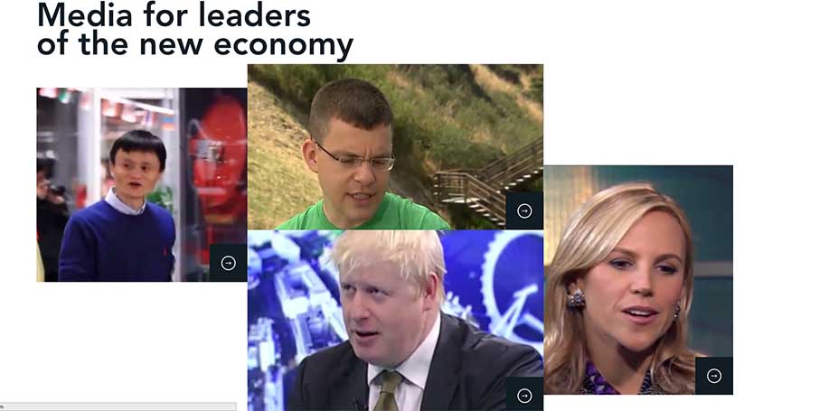
As in the Hero area above – there’s this space called “Media for leaders of the new economy” that is a great showcasing of the more in-depth video that is on Bloomberg’s television offerings – but that is now integrated into their online portfolio too. They have again used the video background hover – that isn’t just a loop like most video backgrounds. Ok, it’s a larger loop, but it pauses when you stop hovering, and continues play on hover again.
Portfolio View – Regular
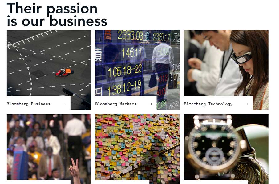
As with most agency sites – have to get in the portfolio somehow – visually is better. But I like the change-here – we go from normal box type as above…
Portfolio View – Modal?
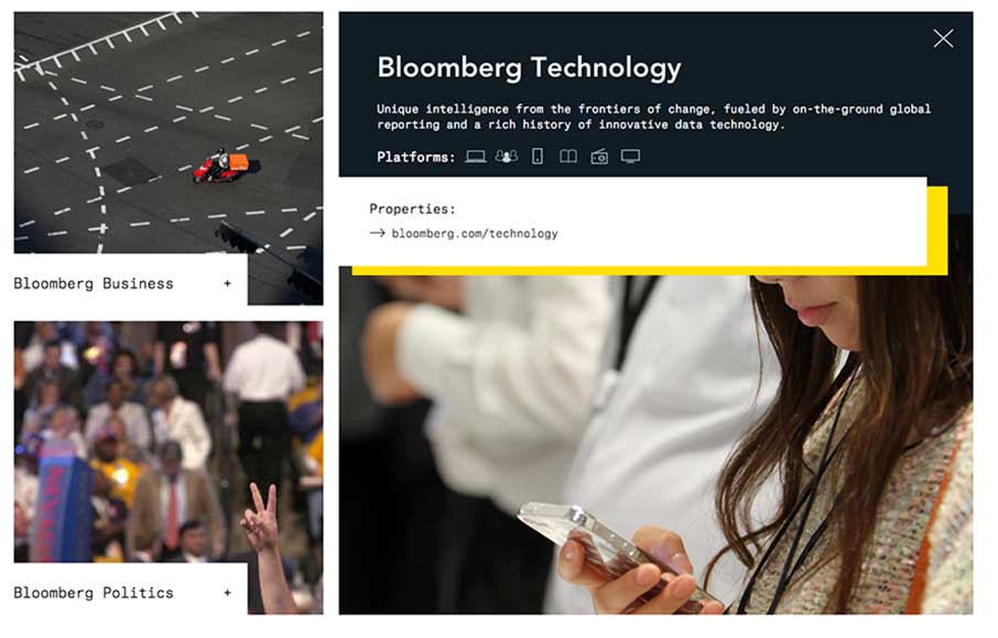
and on-click, the shape of this area changes to highlight the portfolio area you’re on (and it could even be some type of modal? If so, one of the better uses of a modal).
PDF Repository
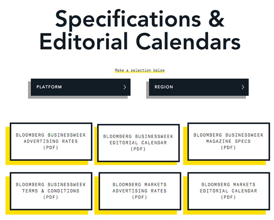
Listen – whenever we’re building a website, and a client tells us that they want a page that has a whole bunch of downloadable PDFs on it… kill me…. So I like this approach a little better. They use a faceted search and jQuery masonry thing like other sites are doing to organize matrix like info here – but the design choice was kind of cool. How the heck do you represent a PDF without that stupid document icon (that the rest of us seem to always use)? Stick an “Atlas Typewriter” flat font on the wording, give it some drop-shadow – and bam, you have something new to say “download this thing”.
Actually – the mobile / phone version of this site has a lot of the flat icon / flat font like this page, instead of trying to get all of it to explode your phone at once. (goes back to information architecture and wire framing well folks).
Footer

Finally – the toe (why footer btw? we’ve always said “head to toe” right? – to-er? never mind, it’s 4am and I’m finishing this up…). I just like this footer because it has some texture to it – not in the background, but the raised “Contact” label over the image – and then real call-to-action pieces that go directly back to those advertisers and media planners that we spoke about way up at the, head..top… It really is good planning, and some nifty design.
We held off on reviewing this site so that we could look at it a little more. I wish we could do it with more sites, especially the good ones like this one.
Interested in Unmatchedstyle profiling your website in-depth? Just fill out the form – “need the info” – make sure you talk a little about the design so we can quote you. We can’t guarantee it to be fully analyzed like this one, and can’t guarantee it will get reviewed (we get a lot of requests, and try to have some standards) – but we’re making this type of long form gallery post part of our weekly editorial calendar. Let us know what you think!



0 Comments
Trackbacks/Pingbacks