
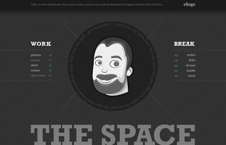
I really love the character put into this sigle page scroller site. The dark backgrounds sets the mood and the illustration and roll over detail adds a nice layer of surprise to the design. The lines really help guide your eye around and down the page too. I also love the details around the form fields, that’s a nice touch.




0 Comments