
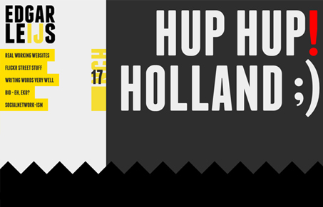
I really dig this stark huge graphic style, it reminds me very much of Bauhaus type design. It’s a balance, some of that design style makes things really clear and simple, yet because of the fact that it’s all on the same level of hierarchy visually certain elements can be hidden, like the PRV and NXT links for the portfolio pieces. Overall though, I like the site and it’s a unique piece of work that’s refreshing to experience.




0 Comments