
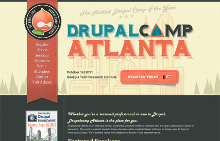
Pretty nifty looking conference website design. I love the colors and bold typography here. I also like what they’ve done with the Drupal logo. It’s a straight forward website design and that’s pretty much what the doctor ordered for something like this. Good looking site.




It does have a nice feel to it. I especially like the soft, leather bevels along the stitching.