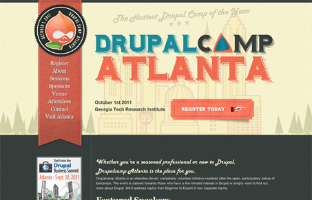
Pretty nifty looking conference website design. I love the colors and bold typography here. I also like what they’ve done with the Drupal logo. It’s a straight forward website design and that’s pretty much what the doctor ordered for something like this. Good looking site.
Glassmorphism: The Transparent Design Trend That Refuses to Fade
Glassmorphism brings transparency, depth, and light back into modern UI. Learn how this “frosted glass” design trend enhances hierarchy, focus, and atmosphere, plus how to implement it in CSS responsibly.


It does have a nice feel to it. I especially like the soft, leather bevels along the stitching.