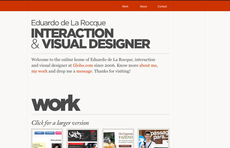
I’m loving the typography and simple layout of this website. The stark red and gray work really well together, especially when used minimally like this. I do feel that this site would be much nicer having actual pages, that is different pages throughout the site instead of the jquery scrolling to the anchor effect. Overall though, this is a really great looking simple design.
Glassmorphism: The Transparent Design Trend That Refuses to Fade
Glassmorphism brings transparency, depth, and light back into modern UI. Learn how this “frosted glass” design trend enhances hierarchy, focus, and atmosphere, plus how to implement it in CSS responsibly.


0 Comments